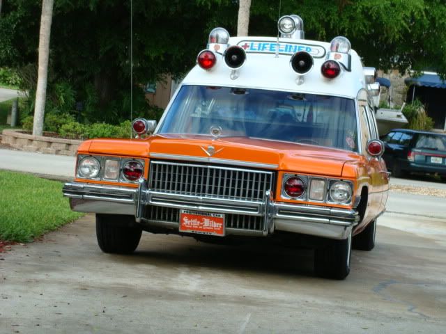
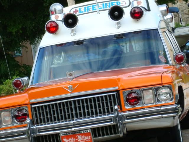
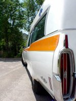
OK guys... back to the topic of Richard's angled pictures...
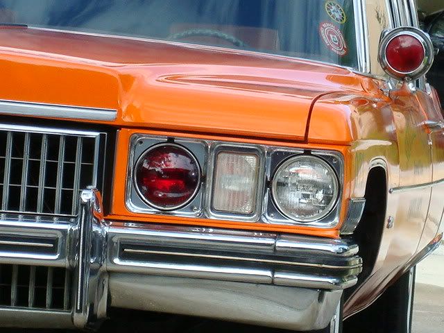
I'm really not sure what I think of the first and last photos, but I can say that I really like the middle picture. I think that this kind of picture really gets people thinking and wanting to see more. Kind of like a tease.
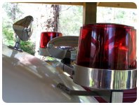
I have always enjoyed close up pictures of lights and sirens. Sometimes a close up of just a hood ornament or a Superior logo (or MM or Flxible or etc) is really nice. It's the details, like the lights and sirens and coach builder logos, in these cars that make them stick out.
I do agree with Attila though in the fact that a square, level picture is better for publication. I am not only the editor for The Livery (the Tri-State Chapter newsletter) but I also put together the professional car calendars for the TSC every year and it is definitely nice to have a square picture when you need to crop to make it fit.